
Booking products were originally designed for hotels. Homes and apartments have a set of specific needs (especially) on post-booking, due to the fact that they usually don’t have reception. It’s a critical part of the customer journey and the last thing we want is for them to experience the frustration of not being able to get into the property they booked.

Intro
My team was created to identify and solve top pain points that guests with upcoming bookings might have on apps, the most used platform on pre-stay part of their journey.
Deep diving on previous research and customer service reports, we identified the main pain points related to Post Booking for homes and apartments:
1. Arrival arrangements
2. Key collection
3. Check-in instructions
Sense the water
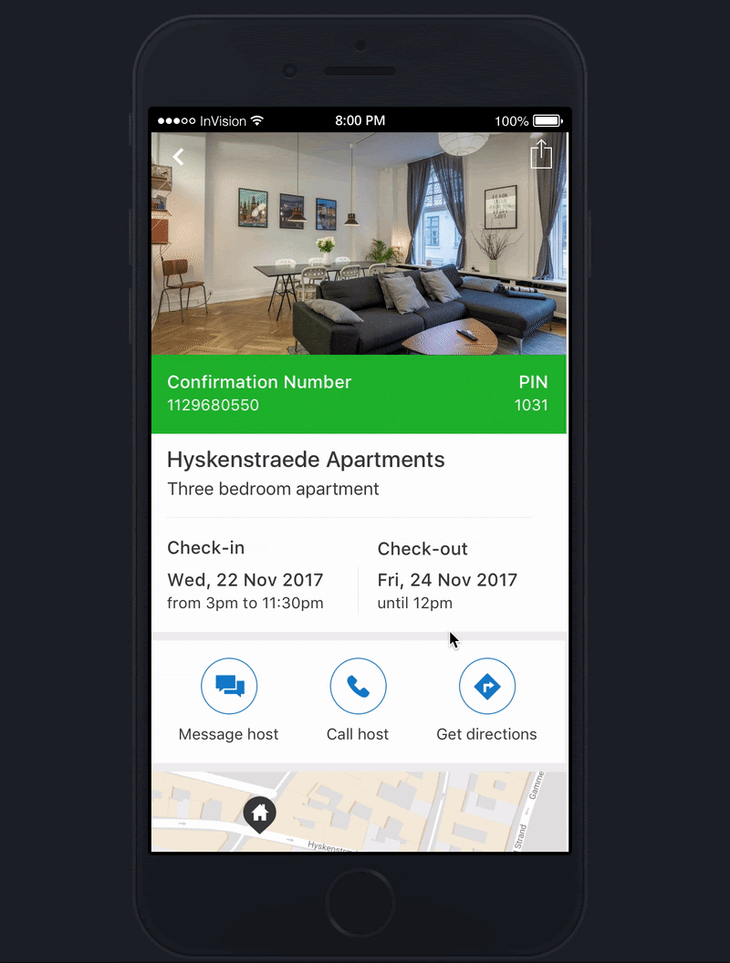
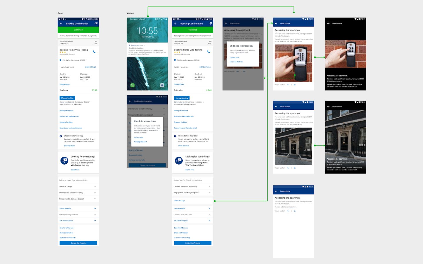
To explore solutions for the user pain points we had identified on research, I have created a prototype that consisted of a simplified version of the confirmation page.
It introduced information about the key collection address in a different location than the property, and entry points to arrival time submission and a host guide.
My plan was to run a user test so I would be able to quickly understand users perspectives on it.
I wrote scripts and defined screening criteria in collaboration with my PO and researcher to run the first batch of user tests. This unmoderated user research, using usertesting.com, involved 19 participants (1 pilot, 9 iOS and 9 Android participants).
Following-up, I have organized a session for my whole team to watch the recorded videos from the research sessions and take notes.
I compiled the results in an affinity diagram and used the learnings to create an action plan to tackle each pain point individually.
The vision
After the first test, I started working on the vision for Booking Home Post Booking, continuously getting input and feedback from Post Booking Core (Hotel) Apps team. This was important to identify overlaps and ensure that Core Post Booking wouldn’t be negatively impacted by any changes proposed for Booking Home.
This vision was then strategically split into smaller experiments, so that we could assess the impact generated by each part of the holistic solution.
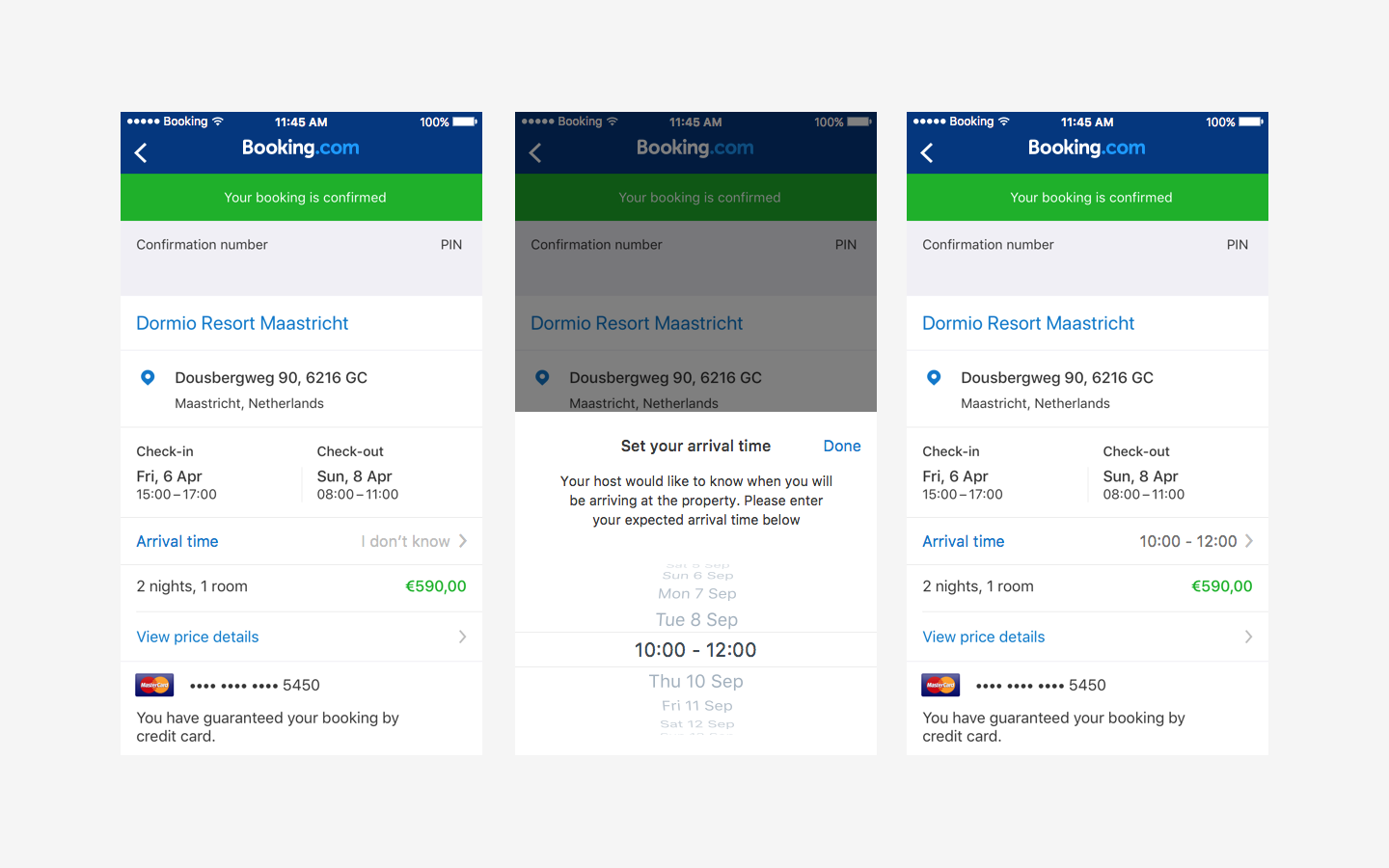
01. Arrival Arrangements

Confirmation Page
Why
One of the biggest learnings of the user test was that when arrival time matches the check-in window, customers assume they don’t have to do anything (i.e contact the host) or inform arrival time. But they actually do need to inform it – on Booking Home properties there is no reception and the hosts have to plan their day accordingly. This way, they can get the house ready, hand the keys to the guest and provide further instructions.
What
I created experiments on post booking and booking process, focused on making clearear to the user how to submit their arrival time information and why this is necessary.
Before the experiment, users would only be able to submit their arrival time as a special request for check-in time. So, they would usually fill it only when it was outside of the check-in window.
How
We implemented the arrival time input on booking process and confirmation page, making it more visible and explaining to guests why the host needs this information. But most importantly, now all guests are able to see the arrival time input clearly in the flow, not only the ones with special requests.
Impact
∙ Interaction with component – High percentage of users opened the arrival time picker and have submitted arrival time
∙ Decreased Customer Service tickets per day related to this topic.
∙ Less users left their phone number field empty on Booking Process – potentially because they now understand the host could need it for arrival arrangements
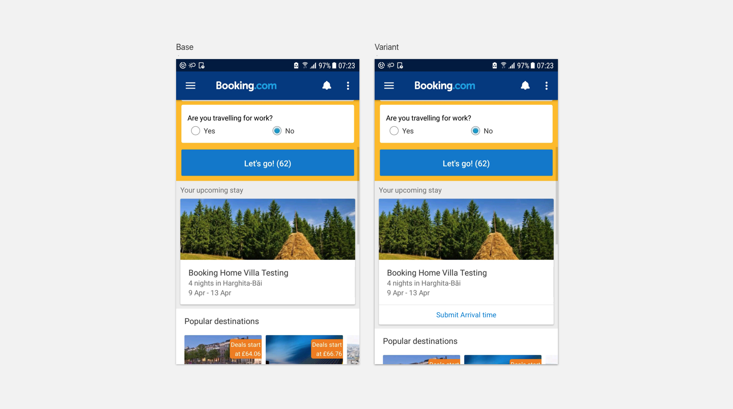
Index Page
Why
We also knew that several users didn’t get to confirmation screen on apps as they go from ”My Bookings” straight to property page. Therefore they were not exposed to the entry point to submit arrival time.WhatAs users see index every time they open the app, I believed that “Upcoming Stay” block was a good place to ask for arrival time.
How
Showing it on “Upcoming Stay” block to users who booked Homes or Apartments and haven’t submitted arrival time through the app yet.
Impact
∙ Interaction with component – High percentage of users opened the arrival time picker and have submitted arrival time
∙ Decreased Customer Service tickets per day related to this topic.
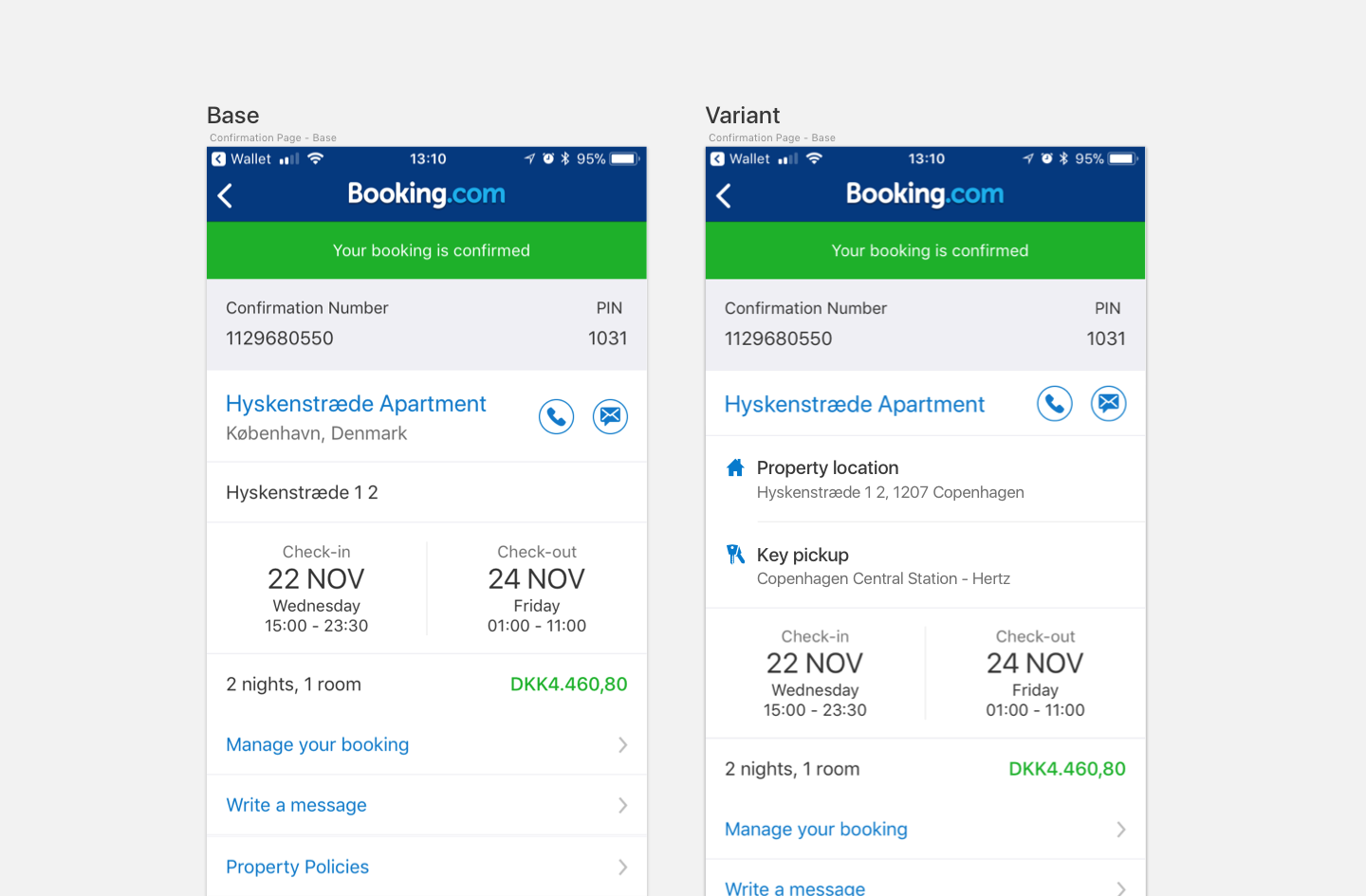
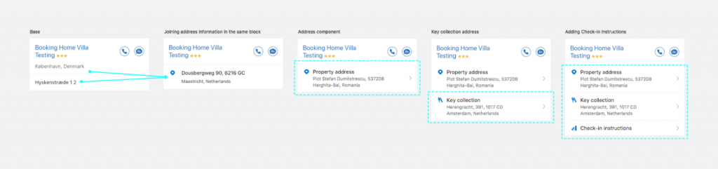
02. Key Collection

Why
When users are not aware that the key collection is in a different address than the property:
∙ They might be confused and lost, especially when travelling abroad without a mobile data plan
∙ They might be literally “locked out” of the property for a while, subject to heavy weather and carrying luggage
∙ Naturally, Booking get customer service tickets on this topic as a consequence.
What
Make it celarer to the user when the key collection is in a different address than the property.
How
Designing a component to display key collection information at the confirmation page – clearly differentiating the property address versus the key collection address.
Impact
∙ Decreased Customer Service tickets per day related to this topic.
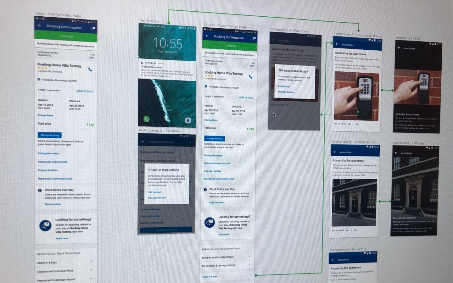
03. Check-in instructions

Hypothesis
Why
One of the most highlighted topics on research was “how to get into the property”. This includes details like:
∙ Do I get a physical key or a code?
∙ Where do I get the key? Is it hidden somewhere? (e.g.: under a rug)
∙ By what means do I get the code? (e.g.: sms)
∙ When will I get this information from the host?
∙ What should I do if the key or code doesn’t work?
∙ Other special instructions
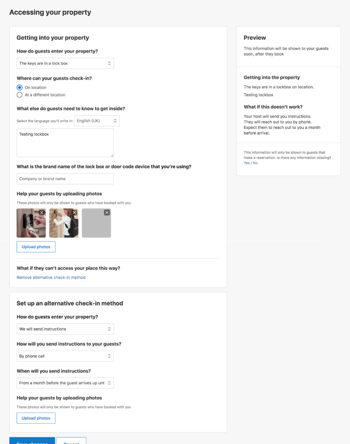
This information was already collected to a certain level from the partners, but not displayed on the user-facing pages.
How – Phase I
∙ I have worked together with skakeholder teams to check how this information was collected at the moment on the Extranet, and how it could be improved considering the pain points identified.
∙ We then developed a series of experiments to shape the data collection about check-in instructions on the partner side and fill in the gaps we had.∙ We also created a “fake door” experiment where we placed an entry point for more check-in instructions. About 20% of page visitors interacted with this component (more about it below).
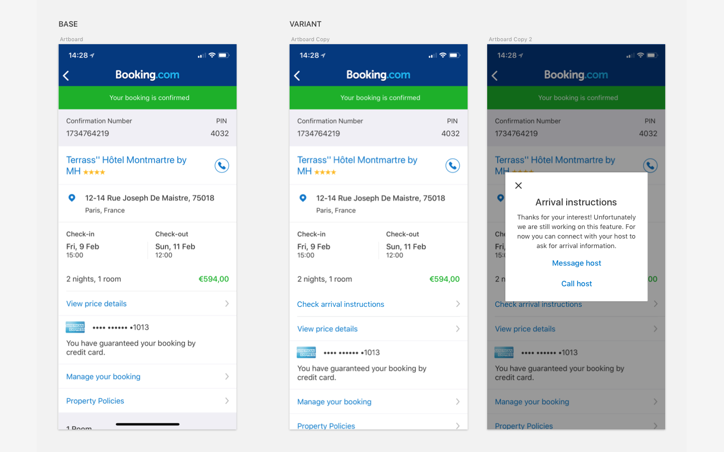
Running a fake door experiment, we were able to gather user intent and how they perceive the newly added information.
∙ Interaction with component – High percentage of users interacted with the component
∙ High percentage of users called the host
∙ Decreased Customer Service tickets per day related to this topic.
How – Phase II
∙ With the new Extranet page and the positive signals of the fake door experiment
∙ I have worked on the new flow, which was validated with user research (more about it below)
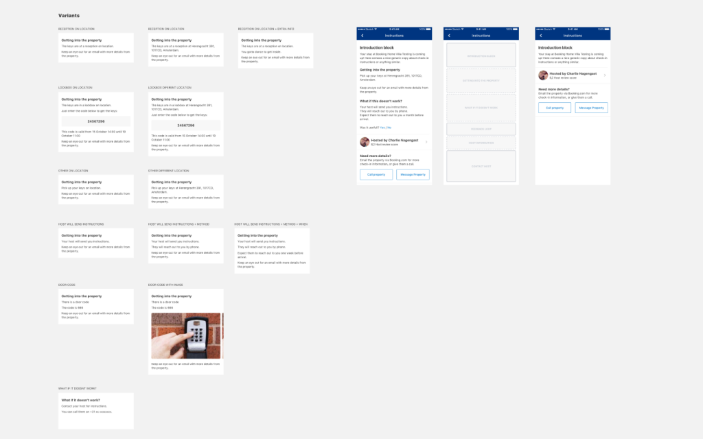
∙ Following-up I have restructured the information architecture of the new check-in instructions page with the combinations of different pieces of information ( more about it below)
∙ Created the vision to display Check-in instructions to the guest.
Research time!
Setup
For this research, I’ve written the moderation script in collaboration with my PO and UX Researchers on the department, created a prototype and a series of cards with the blocks of information. The cards would be used at the end of the session, where participants would be asked to reorder the page to better suit their needs.
The goal of this research was:
∙ Understanding what information was important to customers arriving at a property
∙ Gather feedback about the experience provided by our confirmation page on post booking
∙ Validate our two new features: check-in instructions and arrival time submission
Research time again
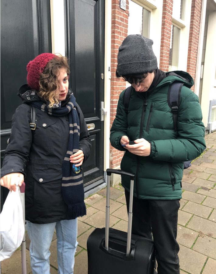
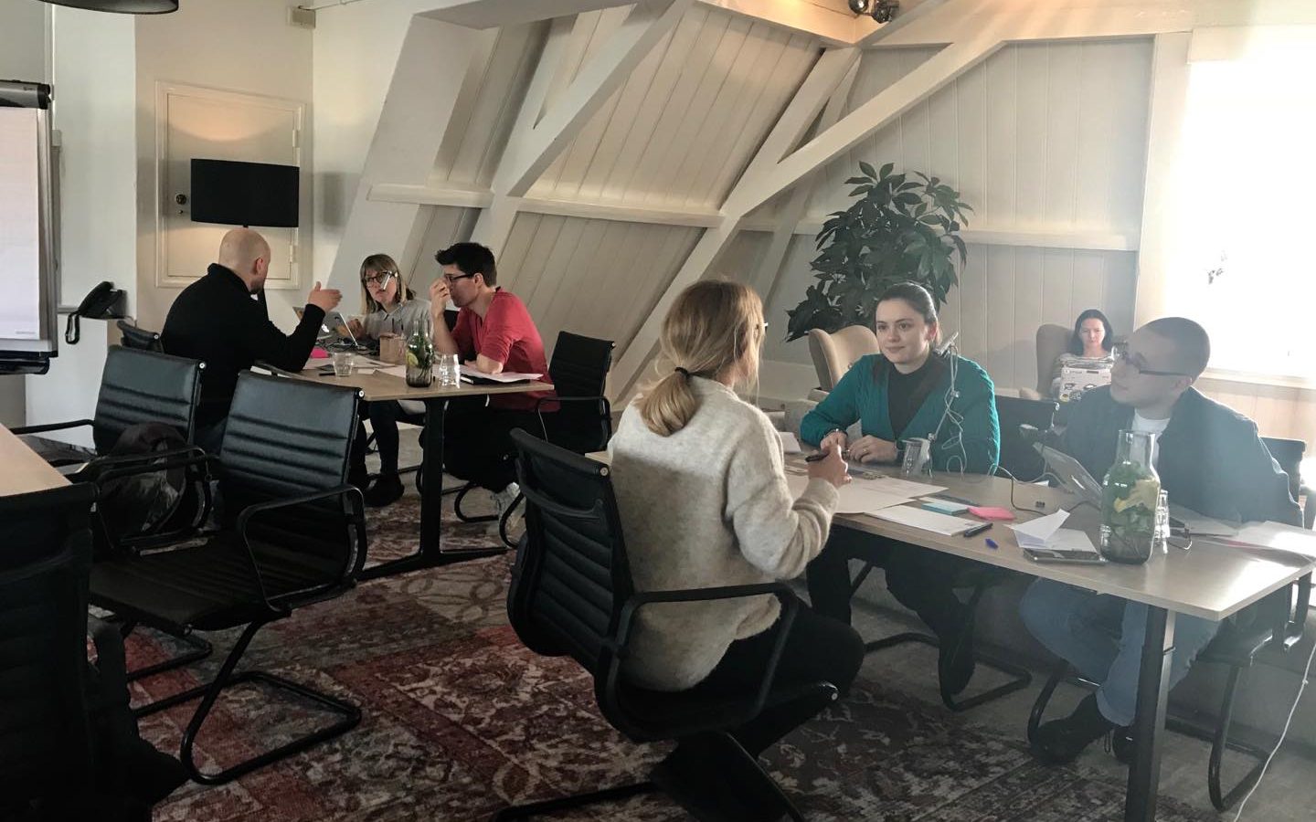
The research happened in a co-working space in Amsterdam with 6 participants. It had 3 parts:
Part 1
My teammates and I presented the prototypes to the users and asked them to perform the scripted tasks.
Part 2
Then we showed the same prototype in paper, cut out in pieces, and asked the users to reorder the page the way they thought best to perform the tasks.
Part 3
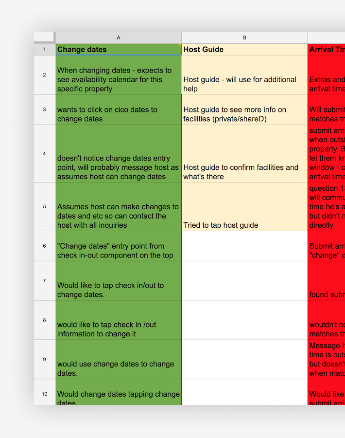
At the end, we compared and analysed all the results and were able to identify what pieces of information were more relevant and when.
Minimum valuable product
With quantitative and quantitative insights, I was able to design the ideal flow/vision for check-in instructions, from which we selected the main features to make the MVP.
The MVP included an entry point for basic check-in instructions on the confirmation page, and displaying them on a new screen.
Impact
∙ High percentage of users interacted with the newly introduced features
∙ Substantial cecreased Customer Service tickets per day related to this topic.
Understanding impact besides metrics
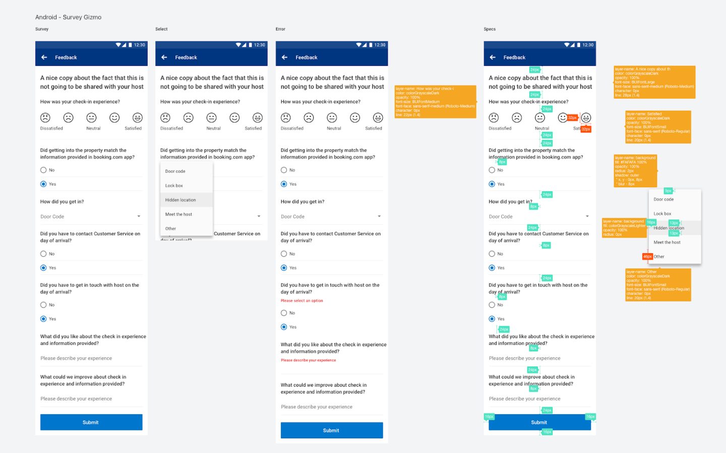
After launching the MVP for check in instructions, we wanted to get a better understanding of how useful they were to the guest, and if the information provided by the host matched the guest experience.
In collaboration with the research team, we created a script to collect this information on a feedback loop. Other teams had been using SurveyGizmo on web, but there was nothing ready to use on apps.
I mapped input components within our guidelines to cover the most common surveys needs. Then we built a native service (Android and iOS) to run SurveyGizmo completely white label.
It was created on a flexible and reusable way, which can be easily used by other teams when they need to gather user feedback, without creating everything from scratch.
Survey insights
∙ Contacting the host regarding the process of getting in is much more common than reaching out to CS. Hence, key collection friction is not strongly present in Customer Service data.
∙ Partner-initiated relocation is the biggest friction, potentially due to guests’ lack of knowledge of what to do in such situations.
∙ Picking up keys in a different address is still something that negatively affects the experience of the guests, even though we worked hard to raise awareness of it.
∙ In half of cases user’s self-reported method of getting in matched the one set by property (i.e in half of cases it either didn’t match or wasn’t provided).
Enabling communication
The baseline experience presented the guest contact details of host only if they said the information isn’t helpful. Since we were got a very small number of users saying it’s not helpful, most users couldn’t easily reach out to the host for details.
Adding the functionality to call or email the host dramatically increased interaction with host and therefore reduced CS inbound
Impact
∙ Decreased Customer Service tickets per day related to this topic.
Wrapping up
I truly believe that after almost a year working on the Post Booking topic, my team and I have made great improvements on the overall experience. We shaped it not only for Homes and Apartments or Apps, but influenced the whole product to provide the so needed information at this critical part of the journey.
I’m really proud of the work done around the pre stay topic, knowing that now:
Guests:
∙ Can efficiently inform their arrival time
∙ Have clear information about how to get in the property
∙ Are able to prepare in advance if the keys are in a different location
And Hosts:
∙ Know exactly when the guest is arriving
∙ Are able to provide better check-in instructions
∙ Can arrange the key handling seamlessly